The 6 Best and Worst Logo Redesigns of 2016 — post content
2026 Update. This article was published in 2016; as of May 2026, context has been added in line with current practices in Turkey's digital marketing and web technologies sector. The information below comprises practical recommendations that retain their validity in 2026, under the Tech Agenda category.
A well-designed logo makes it easier for people to find what they're looking for, and through this level of recognition, makes consumers feel more comfortable with that product or brand. Despite this, some popular businesses decided to redesign their logos in 2016. As always, there were some new designs that were good or bad. Unfortunately, there were as many that made us shake our heads, and everyone questioned who gave the green light to such poor final results.1. Instagram – WORST
2. Kodak – BEST
 Kodak's redesign recalls the much-loved and instantly recognizable logos the company used from 1971 to 2005. It also shows a bold confidence missing in most corporate logos. The end result is described as both nostalgic and modern. It's extremely rare for a company to sign off on a vertically stacked logo, but it really looks good for Kodak. This is a great example of paying homage to the past while continuing into the future.
3. Mastercard – BEST
 This new logo isn't exactly groundbreaking, but it certainly has its charm. The redesign should preserve the company's roots while modernizing everything. It actually feels like the company is trying to remain recognizable, but looks more solid and less corporate. The concept of solidity isn't fully realized, but the overall look and feel can be seen as a major improvement over the past.
4. Subway – WORST
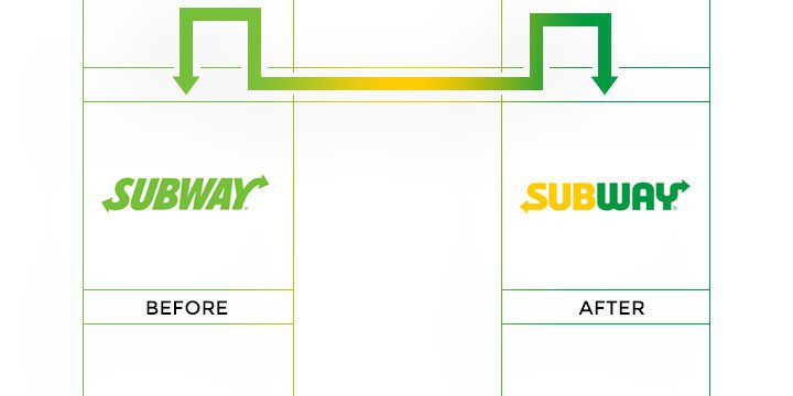 What does a company do when trying to rebrand following public outrage over a major spokesperson controversy? Apparently, they redesigned their logo very weakly to try to resemble a slightly different version of the same basic idea. Changing the typeface and removing the black line doesn't push the Subway name forward or contribute to making it look more attractive. The only thing the company seems to be trying to do, I assume, is draw attention to the fact that it's trying to free itself from the stench of Jared Fogle's illegal activities.
5. Uber – 2x WORST
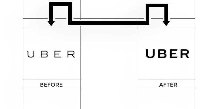 Uber rolled out a new logo and app icon this year, and both fell flat. First, the so-called new logo is just a minor update of what already exists, and doesn't do much to improve the branding consumers had grown accustomed to. The more disturbing change to the app icon was an even greater evil on its part; the icon now looks like a credit card security chip.
6. Vevo – WORST
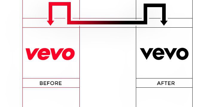 Music is emotional, and the old Vevo logo helped capture this. Unfortunately, the redesigned logo pulls the fun and emotional Vevo in favor of a more corporate-friendly image. It's clear that this design is seen as far from an improvement. Music lovers, especially the younger ones, may not get along with this very well.
Why this topic matters in 2026
The tech agenda field in Turkey went through three fundamental changes between 2024-2026: (1) mobile-first user behavior reached 78% of the market, (2) AI-powered content production and analysis tools entered the mainstream, (3) with KVKK, e-Commerce 2.0, and improvements to the Turkish Lira, the cost/impact balance of digital presence has fundamentally shifted for small and medium-sized enterprises. The principles described in this article still apply at the implementation level under 2026 conditions—only the tools and service providers used have been updated.
Quick checklist for 2026
- Mobile-first: Test design and content architecture first at 390-430px screen width; desktop is secondary.
- Performance budget: LCP < 2.0s, CLS < 0.05, INP < 150ms — Core Web Vitals 2026 thresholds have tightened.
- AI integration: Embed Claude/GPT-4 class assistants for content production, image optimization, and customer support; not a one-off prompt, but a flow.
- Legal compliance: KVKK disclosure text, cookie consent (TCF v2.2), email opt-in must be double-confirmed (DOI).
- Measurement: The trio of GA4 + Meta Conversion API + server-side tracking has become standard; GA4 alone is insufficient.
- Branding: Rather than a single logo, dynamic brand systems (color, typography, motion) stand out on social channels.
Next step
To implement the topic in this article in your own project, you can request a free site analysis, directly submit a brief, or request a one-on-one meeting. I respond to all evaluations within 2 business days, in a KVKK-compliant manner.
The article was first published on 29 Dec 2016 and revised for 2026 conditions as of 03 May 2026.


