How to Choose a Font for Your Brand — post content
Although less flashy than brand marks and imagery, solid brand font selection is the glue that ties your entire identity together. Fonts tell a story by adding voice and personality to your business. Whether in print or online, good typography can engage your audience; bad typography can drive them away.
If you already have a logo, you may already have a font selected to fit your aesthetic. However, the work doesn't end there; you'll also need a strong secondary typeface and a clear body copy font.
When you start the process, the sheer volume of fonts available can be overwhelming. Follow these guidelines to find the fonts that are best suited for your brand.
 font differences[/caption]
 There are two basic ways to do this: you can either use two complementary fonts from two of the categories above, or you can mix two styles from the same family. For example: sans serifs work well as a secondary font for section headings, especially if your main font is a serif. On the other hand, using a bold font for headings and a smaller, regular weight for the body creates the same pleasing contrast.
Whichever method you choose, make sure your fonts have an appropriate hierarchy. Typographic hierarchy is the order in which fonts best communicate the information you need your reader to understand. In this article, what you're reading right now, for example "Building successful font combinations and hierarchy," lets you know we're entering a different topic by being a different size and weight.
There are two basic ways to do this: you can either use two complementary fonts from two of the categories above, or you can mix two styles from the same family. For example: sans serifs work well as a secondary font for section headings, especially if your main font is a serif. On the other hand, using a bold font for headings and a smaller, regular weight for the body creates the same pleasing contrast.
Whichever method you choose, make sure your fonts have an appropriate hierarchy. Typographic hierarchy is the order in which fonts best communicate the information you need your reader to understand. In this article, what you're reading right now, for example "Building successful font combinations and hierarchy," lets you know we're entering a different topic by being a different size and weight.
Sending Branded Messages With Type
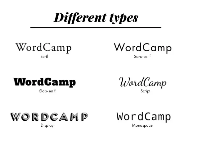
Even before a customer reads your marketing message, the font is already communicating something to them. Each font conveys a different message and has different strengths and weaknesses.Serif fonts
Serif fonts are the oldest, most classic fonts. A "serif" is a small decorative line at the end of a character's stroke. The most popular and ubiquitous example is Times New Roman, the default font for generations using Microsoft Word. Serif fonts are classy, literary, and high-quality. They're always a good choice for extended paragraphs of text such as books, brochures, and fine prints, because they're highly readable and our eyes are accustomed to their shapes. [caption id="attachment_6866" align="aligncenter" width="800"] font differences[/caption]
Sans serif fonts
If you took French in high school, you might have pieced together what serif means - "without serifs." They don't have the little feet that serifed fonts have, and they can also have lines of consistent thickness from end to end. This article is in a sans serif font! They're perfect for general readability and work very well for clean printing. They also have the benefit of working well at low resolutions, making them perfect for digital use, including websites and e-readers. They always bring strength, clarity, and a modern, clean look to any project they're in. Different weights of the same font, for example, offer different lines: bold sans serifs are masculine and hardworking, while a thin-line version looks elegant and noble.Slab fonts
Slab fonts are identified by their blocky strokes. If you've ever typed on an old typewriter, you've seen slab fonts. They bring an old-school, almost geeky charm to a project or brand. They need to be used carefully and are usually better for logos and headlines than for extended text, but they're still easy on the eyes.
Script fonts
Script fonts are intuitive; they look like handwriting! In recent years, as people have looked for unique ways to represent their brand, the availability of script fonts has skyrocketed. There's a wide variety of unique script fonts that closely resemble handwriting. They range from extremely calligraphic styles found on wedding invitations to worldly styles bloggers use to mimic handwriting. They're not suitable for decorative or long paragraphs of text, but they can bring gentle femininity wherever they appear.Decorative fonts
These are highly stylized fonts that evoke very specific feelings in the reader. You should always be careful when using decorative (or display) fonts. Why? Because many of them are very, very bad (we all know how the internet feels about Comic Sans). However, as with anything strange, they shouldn't be avoided altogether. They're never a good choice for secondary fonts or body text fonts. Think of them like fireworks: even if they're fun, it's best left to trained professionals. Whatever font you choose, be careful using types that are "trendy." While every designer has their own opinion on which fonts fall into this category, the decisions you make for your brand should remain consistent for years. You don't want your fonts to look dated too quickly.Building successful font combinations and hierarchy
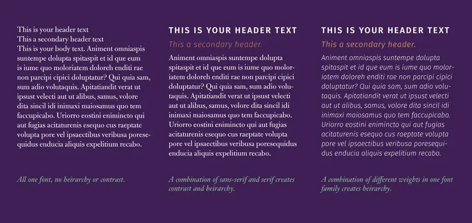
Five minutes on Pinterest will give you dozens upon dozens of graphics promising to create amazing font combinations. Clicking often leads to dead links and free fonts with limited usability, while emphasizing the importance of successful font mixing. Fonts are most powerful when used in opposition to and support of other fonts, especially those that provide contrast.
There are two basic ways to do this: you can either use two complementary fonts from two of the categories above, or you can mix two styles from the same family. For example: sans serifs work well as a secondary font for section headings, especially if your main font is a serif. On the other hand, using a bold font for headings and a smaller, regular weight for the body creates the same pleasing contrast.
Whichever method you choose, make sure your fonts have an appropriate hierarchy. Typographic hierarchy is the order in which fonts best communicate the information you need your reader to understand. In this article, what you're reading right now, for example "Building successful font combinations and hierarchy," lets you know we're entering a different topic by being a different size and weight.


