How to Create the Right Logo File for Your Client and How to Present It [In Detail] — post content
I actually wrote about preparing and producing logo files for clients in 2015, but since then I've improved the process and formatting, and this time I want to do a better job — looking at things more in detail and helping you understand them better. In this post, I'll cover all the file formats, variations, and sizes a finished logo design needs to deliver, and how I assign everything to a clean, organized folder system. This is the approach I've used for dozens of logo clients throughout my 10 years of experience.
You may have noticed a change on logo design delivery pages. We used to ask for at least an .eps or .ai file, but now we ask for a PDF file instead of an .eps file in addition to other file types. The list of files you need to provide on logo delivery:
 When a client hires us to design a logo, it's our job to make sure we provide them with everything they need for any way they might use their logo. Whether it's blown up to fit a billboard, scaled down to be embroidered on a shirt, used in a strictly black-and-white context, or anything else.
 For clients, you don't need to include a favicon among the logo files, but if you're feeling generous, it's a nice thing to do. I like to include it as an incentive in my more expensive pricing packages.
It's important to note that the favicon as we know it (16 x 16 .ico file) has become trivial for most ordinary website creators. These days, most WordPress themes (and I imagine this applies to Shopify, Weebly, and other popular website-building platforms) let you upload a 512 x 512 .png file to use as a site icon clearly, like a favicon in the browser's tab. In that case, a swap of the client's iconic mark will work just fine.
Please remember that this 3-part structure breakdown won't always apply on every logo project. Some logo types — such as badges and emblems — fuse all three elements together. In such cases, you don't need to create separate files for the wordmark and the iconic mark because they're an all-in-one deal.
For clients, you don't need to include a favicon among the logo files, but if you're feeling generous, it's a nice thing to do. I like to include it as an incentive in my more expensive pricing packages.
It's important to note that the favicon as we know it (16 x 16 .ico file) has become trivial for most ordinary website creators. These days, most WordPress themes (and I imagine this applies to Shopify, Weebly, and other popular website-building platforms) let you upload a 512 x 512 .png file to use as a site icon clearly, like a favicon in the browser's tab. In that case, a swap of the client's iconic mark will work just fine.
Please remember that this 3-part structure breakdown won't always apply on every logo project. Some logo types — such as badges and emblems — fuse all three elements together. In such cases, you don't need to create separate files for the wordmark and the iconic mark because they're an all-in-one deal.
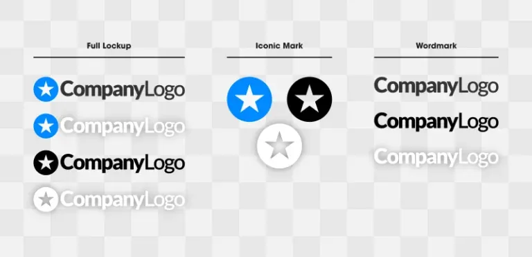
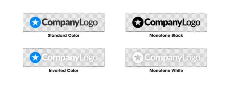 Full Color
This is the full-color standard variation and will probably be the most-used variation. It is intended to sit on white / light-colored backgrounds.
Inverted Colors
This is another full-color variation, but inverted. It is intended for use on black / dark backgrounds.
A nice example is the header section of the website you're reading right now. I mostly use the standard white variation, but on pages where the navigation header sits on a darker ground, I use the inverted (white copy).
Full Color
This is the full-color standard variation and will probably be the most-used variation. It is intended to sit on white / light-colored backgrounds.
Inverted Colors
This is another full-color variation, but inverted. It is intended for use on black / dark backgrounds.
A nice example is the header section of the website you're reading right now. I mostly use the standard white variation, but on pages where the navigation header sits on a darker ground, I use the inverted (white copy).
 Monotone
The last color variation is monotone — both black and white.
These won't be used as often as the full-color variations, but it's important to have copies of them on hand regardless. If you use your logo in a very simplified context (such as a black-and-white fax printout, or cut into a steel sign), these monotone copies will offer the versatility needed to make this happen.
Depending on the style of the logo, you may need to create a completely separate design with negative space to make this happen, as noted below.
Considering the structure and color differences, the files we'll produce for our example logo are as follows…
Monotone
The last color variation is monotone — both black and white.
These won't be used as often as the full-color variations, but it's important to have copies of them on hand regardless. If you use your logo in a very simplified context (such as a black-and-white fax printout, or cut into a steel sign), these monotone copies will offer the versatility needed to make this happen.
Depending on the style of the logo, you may need to create a completely separate design with negative space to make this happen, as noted below.
Considering the structure and color differences, the files we'll produce for our example logo are as follows…

 If the design extends all the way to the edges, your client will most likely come back and ask for copies of the design with some padding added. So as not to waste both your and the client's time, what I like to do is set the document size to 1920 pixels but the icon size to 1700 pixels. This leaves plenty of empty space around the edges.
 If you want to do the same for the same emblem and wordmark variations, go ahead. It's not necessary, though.
 After I've given all the necessary logo files and assigned them to their respective folders, the final product I want to send my clients is a zipped folder (.zip) of everything. To create ZIP folders (when using Windows), I like to use a free application called 7Zip.
If you're on Ubuntu or another Linux-based operating system, I think it's by right-clicking on the folder and selecting "compress", but don't quote me on that. For Mac users, I'm not sure. For Mac OS, just right-click and choose compress.
After I've given all the necessary logo files and assigned them to their respective folders, the final product I want to send my clients is a zipped folder (.zip) of everything. To create ZIP folders (when using Windows), I like to use a free application called 7Zip.
If you're on Ubuntu or another Linux-based operating system, I think it's by right-clicking on the folder and selecting "compress", but don't quote me on that. For Mac users, I'm not sure. For Mac OS, just right-click and choose compress.
 To avoid this, I like to use a file hosting service like DropBox or Google Drive. I personally like DropBox because the site is so simple to navigate and use, and they make it really easy to create links you can share with your client once the upload is complete. This is not a paid promotion, and I don't use any affiliate links — I just really like and recommend their services.
- Adobe Illustrator (.ai) file
- editable PDF file
- PNG file
- JPG File
Logo Files for the Client
Let's say you've been working with your client for a while — pitching ideas and going back and forth with revisions — and this is the final design they've decided on and want to finalize…Structures
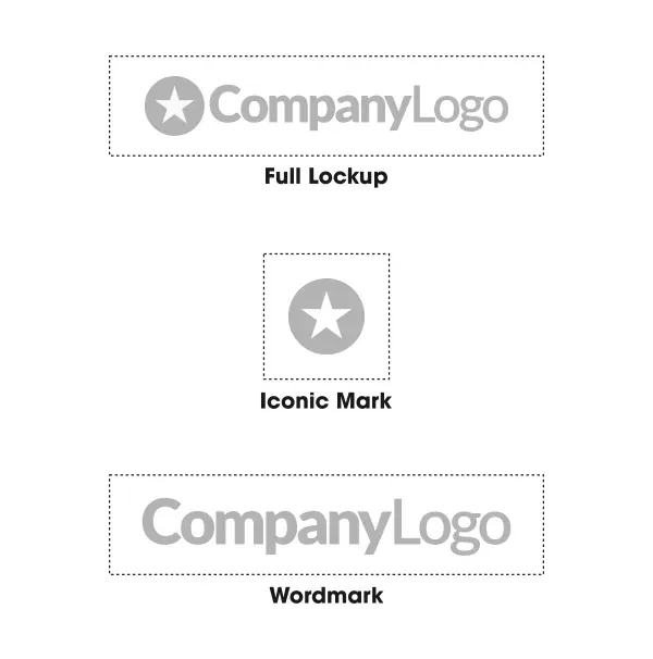
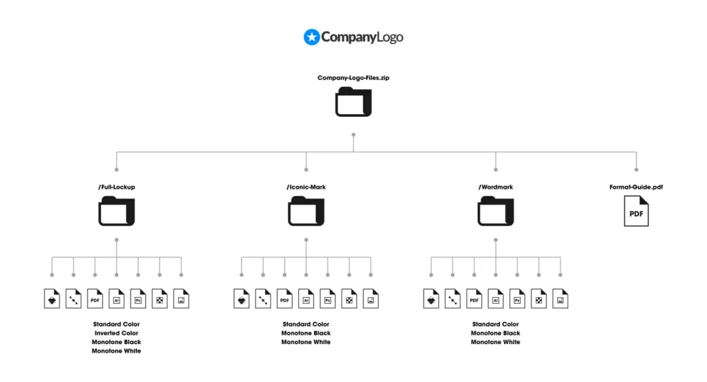
The first thing we need to do is split the logo into three different structures… Full Lockup: Full Logo Look / Logo Iconic Mark: Iconic Mark / Emblem Wordmark: Just the Written Part / Logotype1. Full Logo Lockup
This is the full logo design with both the icon and the accompanying text. This will be the file most often used by your client. A nice example of how it's used is in the header section of websites. This format won't always work in every context, so we need to make a few more variations.2. Iconic Mark
This is the standalone icon, and it's important for your client to have a copy because there will be times they'll need to use only the icon without the text. A nice example would be using it as an avatar on Facebook, Instagram, or Twitter. Profile pictures on most social platforms are formatted to be a symmetric square, so a horizontally oriented logo design (as in our example) won't fit very well. The dimensions force it into a compact size that's hard to read (especially on a mobile device), and there will be unsightly empty space at the top and bottom.3. Wordmark Text
The standalone text will probably be the least-used variation in a logo, but it'll still be useful to have copies regardless. Sometimes a logo needs to fit a very subtle design context where it sits, but other design elements need to stand apart and step back so they can take priority. Using a simple wordmark variation of the logo can help achieve this.Favicon (optional)
A website favicon is the small icon that appears in a website's browser tab. It's processed at 16 x 16 pixels and in .ico format (GIMP does a great job of exporting to this format).
For clients, you don't need to include a favicon among the logo files, but if you're feeling generous, it's a nice thing to do. I like to include it as an incentive in my more expensive pricing packages.
It's important to note that the favicon as we know it (16 x 16 .ico file) has become trivial for most ordinary website creators. These days, most WordPress themes (and I imagine this applies to Shopify, Weebly, and other popular website-building platforms) let you upload a 512 x 512 .png file to use as a site icon clearly, like a favicon in the browser's tab. In that case, a swap of the client's iconic mark will work just fine.
Please remember that this 3-part structure breakdown won't always apply on every logo project. Some logo types — such as badges and emblems — fuse all three elements together. In such cases, you don't need to create separate files for the wordmark and the iconic mark because they're an all-in-one deal.
Color Variations
The next area we need to consider is the colors used for the logo. For all 3 structures, we have to produce files in the following color variations…Logo File Extensions
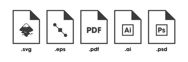
For each structure and each color variation, we'll have to produce various file formats so they can hold unlimited usage potential. Editable Formats Most importantly, your client will sometimes need editable source files, sometimes called "master files". Ideally, a logo should be created in vector format so it can be scaled limitlessly without quality loss. The editable source files that can be added are as follows...- SVG - A true vector format that can be edited with Inkscape, Illustrator, CorelDraw, or any other vector graphics application.
- AI - Another true vector format, only specific to Adobe, so it can really only be used with Illustrator. But it's good to have a copy of this because print shops often want to work with Illustrator files when preparing things for print.
- EPS - This is another editable format. This isn't necessarily a true vector format, but it can be edited with any vector graphics application, and some people prefer to work with it, so I like to include an EPS copy in my logo files for clients as well.
- PDF - Another editable file very similar to the Adobe Illustrator format. However, the advantage of PDF is that it isn't proprietary, meaning it can work with any vector graphics software.
- PSD (Optional) - This is a layered Photoshop file. I don't normally include PSD copies, but clients sometimes ask for them because they're very acquainted with Photoshop (or GIMP) and prefer to use them to modify the designs as needed.
Ready-to-Use Formats
The other category of logo files you need to provide for clients are ready-to-use formats. These are files that can be uploaded directly to the web.
- PNG - First and foremost, you'll want to provide a transparent background for the PNG file. This will probably be the file your client uses most often. PNGs can be uploaded directly to a website to be used as a logo, and because they have a transparent background, they sit nicely on top of whatever color, pattern, image, or video is used as the background. You can see this on my professional logo design portfolio page where the background image at the top of the page shows through the negative space of the logo.
- JPG - This is a slightly useless format in my opinion because it doesn't support alpha channels, meaning no transparent background. The background will usually default to white (unless you specify a color or other fill). However, sometimes your client needs to upload their logo somewhere that (for whatever reason) accepts JPG files; a good logo file for client copies. JPG files also have the added benefit of tending to compress more and take less disk space than their PNG counterparts.
- ICO (Optional) - The final format, as discussed earlier, is ICO, primarily used for favicons. Again, this is optional.
Logo Sizes
Before you start creating all the necessary logo files for the client to use, you should first make sure they're the correct size. If you give the client a logo that's too small, they'll have to scale it up to use it in larger contexts, which makes it look pixelated. Conversely, if you give them a logo that's too large, it takes up an incredible amount of disk space, and they may have trouble uploading it to places with file size limits. Ideally, a logo should be sized so that its largest dimension is 1920 pixels. This means if the logo is wider than it is tall, it should be 1920 pixels wide and let the height fall wherever it may. Similarly, if the logo is taller than it is wide, make it 1920 pixels tall and (*) pixels wide.Why 1920 Pixels?
This is entirely subjective, and of course my own opinion. Considering where we are with technology today, 1920 pixels is just the right size. It's big enough to fit the full width of a Full HD (1080p) monitor, but not big enough to take up an incredible amount of disk space. This recommendation does have a shelf life, though. As of 2018, the vast majority of people visiting my site are still on 720p screens. As time goes by and 4K continues to rapidly become the norm, this is likely to change. All of this is negligible, though. As I mentioned before, one of the reasons we provide our vector files is so the logo can be sized however needed. If you'd rather create the files at 1280 pixels (or some other size in this range), go ahead. It won't make a significant difference in most contexts.For Icons
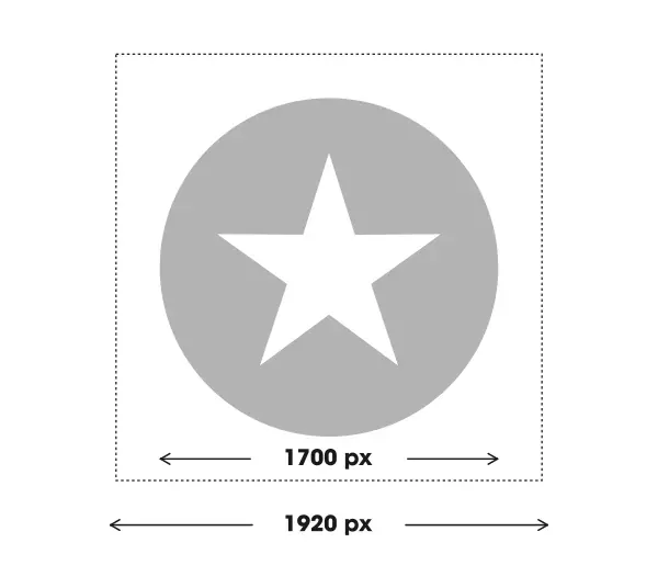
A small piece of advice I want to give you, based on the experience I've gained working with many clients, is to leave some padding around the edges of the iconic mark. The reason is that when your client inevitably uploads this file to their Facebook or Instagram pages, the platform will display the logo extending all the way to the very edges of the design, which looks awkward. Leaving some padding around the edges means it will sit nicely.
If the design extends all the way to the edges, your client will most likely come back and ask for copies of the design with some padding added. So as not to waste both your and the client's time, what I like to do is set the document size to 1920 pixels but the icon size to 1700 pixels. This leaves plenty of empty space around the edges.
Logo Format Guide
Since your client most likely isn't knowledgeable enough about file formats, extensions, and how they can best be used, it's very useful to provide a guide that summarizes such information. Otherwise, they won't have a clue how to best use their new logos. I have a copy of my logo format guide in PDF format, and all I do is click and drop a copy of it into all the logo files I send to a client. You don't need to create a separate guide for every client; you can use the same file over and over. Here's a copy of the example generated guide: LogoFormatGuideFolder Organization
For each logo design project, I like to create a separate folder for all the files. Inside this folder, there are more folders that neatly break apart and organize all the files. Here's a graphic showing how I like to structure the logo files…Precautions
Some points to watch out for when creating logo files for clients… Never Include Font Files If you used a stock font in the logo, don't send your client a copy of it. You'd be breaking the law and risking a potential legal headache if you do. While the design of the letters isn't copyright-protected, the software that creates them (meaning the .TTF or .OTF font file) may be, and I haven't come across many font files that allow you to transfer them between other users — even fonts that are free for commercial use. There are still very strict rules for transferring them. If a client asks you to send them the font file you used, politely explain that this is not allowed by law, and instead, give them a link where they can download and install the font. Convert Text to Paths/Curves Speaking of fonts, make sure not to send design files where the font software is embedded inside. This means converting the text to curves (if you're using Illustrator) or paths (if you're using Inkscape) before saving. Failing to do this is not only a possible legal issue but also means that when someone tries to open it using a machine that doesn't have the specific font, the design of the text will be lost. Be Prepared to Explain PNGs and Transparent Backgrounds Sometimes clients will open one of the PNG files for their logo and think something has gone wrong. For example, if they open the white monotone copy, it's possible they'll think it's a blank document. The reason for this is that the device they're using to view the document defaults to displaying a white background behind an image with a transparent background. This creates the illusion of a giant blank canvas with a white logo on top of a white background. You'll have to explain to them that the document isn't really blank — just appearing that way — and that if they put the file on a dark background (or open it with Photoshop or GIMP), the design will clearly be there. The same goes for Windows 10's new image viewer, which defaults to a black background when displaying PNGs that use transparency. Several of my clients have asked me to give them copies of the logo without the black background, but I've had to explain to them that there is no black background.Managing Large File Sizes
Preparing and creating logo files for clients is a monumental job, and the resulting files sometimes take up a lot of space. If you work on a platform like Upwork or Fiverr, uploading large file sizes probably won't be a worry for you. If you're like me and use email to do business, you may have trouble trying to attach and send 10+ MB files via email. It's not just a hassle — it also takes up unnecessary server space.
To avoid this, I like to use a file hosting service like DropBox or Google Drive. I personally like DropBox because the site is so simple to navigate and use, and they make it really easy to create links you can share with your client once the upload is complete. This is not a paid promotion, and I don't use any affiliate links — I just really like and recommend their services.


