Color Psychology and Tips for Choosing the Right Colors — post content
2026 Update. This article was published in 2024; as of May 2026, context has been added based on current practices in Turkey's digital marketing and web technologies sector. The information below consists of practical recommendations under the Creative Ideas category that remain valid in 2026.
Colors are one of design's most powerful tools, and an effective color choice can help you communicate your brand's message powerfully. Here are some tips to help you perfect your color choices:1️⃣ Consider Color Psychology
Colors have a powerful effect on our emotions and perceptions. For example, blue is generally associated with trust and professionalism, while red can mean energy and passion. Whatever the purpose of your design, understanding the psychological effects of colors can help you choose the right colors.2️⃣ Know Your Target Audience
Your color preferences may vary depending on the demographic characteristics and cultural background of your target audience. For example, vivid and energetic colors are preferred for a young audience, while plain and sophisticated colors may be more suitable for a more mature audience. Knowing your audience is important for capturing their attention and communicating effectively.3️⃣ Keep Colors in Balance
Maintaining a balance between colors makes the design both eye-catching and understandable. Using too many colors can make the design complex and cluttered. You can usually achieve a balanced look by using a combination of primary colors, secondary colors, and neutral colors.4️⃣ Work in Harmony with the Brand's Personality
Choosing colors that match your brand's personality helps strengthen your brand's identity. If your brand is modern and innovative, you can prefer bright and bold colors. However, if you have a traditional and reliable image, using more classic and soft colors may be appropriate.5️⃣ Don't Forget the Importance of Contrast
Contrast increases the readability and visual appeal of the design. Providing sufficient contrast between colors helps text and other elements stand out. Be sure to have enough contrast especially between text and background colors.6️⃣ Blue Is King
Blue is a color generally associated with trust and reliability and is preferred by many brands. It creates both a professional and a calming effect. Corporate and technology-focused brands in particular use blue frequently.7️⃣ Watch Out for Color Blindness
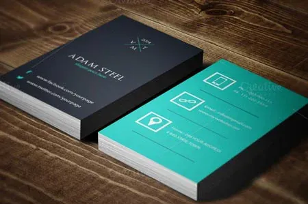
Color blindness means some people are unable to distinguish colors correctly. Considering color blindness in your design ensures it is accessible to all users. When choosing colors, you can check color accessibility using design tools sensitive to color blindness. Colors play a powerful role in design, and by considering these tips you can optimize your color choices and communicate your brand's message more effectively.Images from the article

Why this topic matters in 2026
Turkey's creative ideas landscape went through three fundamental shifts between 2024-2026: (1) mobile-first user behavior reached 78% of the market, (2) AI-powered content production and analysis tools went mainstream, (3) with KVKK, e-Commerce 2.0 and Turkish Lira improvements, the cost/impact balance of digital presence has fundamentally changed for small and medium-sized businesses. The principles described in this article still hold at the application level under 2026 conditions — only the tools and service providers used have been updated.
Quick checklist for 2026
- Mobile-first: Test design and content architecture first at 390-430px screen widths; desktop is secondary.
- Performance budget: LCP < 2.0s, CLS < 0.05, INP < 150ms — Core Web Vitals thresholds tightened in 2026.
- AI integration: Embed Claude/GPT-4 class assistants for content production, image optimization, and customer support; not as one-off prompts but as a flow.
- Legal compliance: KVKK privacy notice, cookie consent (TCF v2.2), email opt-in must be double opt-in (DOI).
- Measurement: The trio of GA4 + Meta Conversion API + server-side tracking became standard; GA4 alone is insufficient.
- Branding: Rather than a single logo, dynamic brand systems (color, typography, motion) stand out across social channels.
Next step
To apply the topic in this article to your own project, you can request a free site analysis, send a brief directly, or request a one-on-one meeting. I respond to all evaluations within 2 business days, in a KVKK-compliant manner.
Article first published on Sep 2, 2024, revised for 2026 conditions as of May 3, 2026.