100 Free Flat Color Palettes to Speed Up Your Design Process (For Illustrator and Photoshop - 2026) — post content
One of a designer's biggest challenges — and at the same time greatest pleasures — is choosing colors. Colors are the most powerful tools that silently convey the soul, emotion and message of a design. While the right color palette can transform an ordinary design into an unforgettable work, the wrong choice can make even the brightest idea fall flat. However, building a harmonious and purposeful color palette from scratch at the start of every new project can often turn into what we might call "color paralysis" — a process that's hard to decide on and time-consuming.

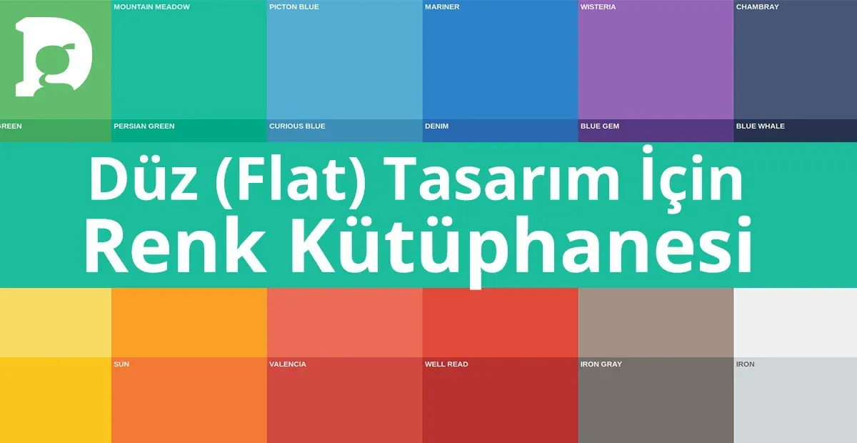
What if you had a ready-made arsenal that would speed up this process, inspire you and add a modern, vibrant and professional touch to your projects? This guide answers exactly that need. We've prepared a completely free color library of 100 carefully selected harmonious colors that perfectly suit "flat design" and modern interface aesthetics. This library is available in both Adobe Illustrator (.ase) and Adobe Photoshop (.aco) formats. This is not just a "freebie," but also a strategic tool that will optimize your workflow, increase your consistency and ignite your creativity. Let's discover the power of colors and how to use this library most efficiently together.
The Hidden Power of a Color Palette: Why Use a Ready-Made Library?
Professional designers know that consistency lies at the foundation of successful projects. A color palette is the backbone of this consistency. Working with a predefined palette instead of choosing colors by eye every time has many advantages:
- Time Saving: It reduces the color selection process, which can take hours at the start of a project, to minutes. It allows you to focus your energy on the other creative aspects of the project.
- Brand Consistency: If you're working on a brand identity, using a defined palette ensures that the brand speaks the same visual language across all materials (website, social media, printed products). This is vital for brand recognition and a professional image.
- Visual Harmony: A good color palette guarantees that the colors within it are compatible with each other. This makes your design look more balanced, aesthetic and pleasing to the eye. It prevents the visual clutter and fatigue that randomly chosen colors can create.
- Reducing Decision Fatigue: A designer makes hundreds of micro-decisions throughout a project. Establishing a framework in advance for a fundamental issue like color reduces this decision fatigue and makes it easier to focus on more important design problems.
This 100-color library we offer provides a perfect starting point especially for modern, minimalist and user-focused designs, allowing you to take advantage of all these benefits.
Get Your Library: 100 Flat Color Palettes
To use this special color library in your projects, you can download it in Illustrator (.ase) and Photoshop (.aco) formats. You can search for terms like "100 free flat color swatches" in your search engine to find various sources, or you can build your own collection. After saving the files to your computer, you can start using them right away by following the upload instructions we'll explain in the next step.
Step-by-Step Setup: How to Load the Color Library into Illustrator and Photoshop
The .ase and .aco files you've downloaded are color swatch library formats that Adobe programs understand. Loading them into your programs is quite simple.
Loading the .ase File for Adobe Illustrator
- Open the Swatches Panel: In Illustrator, open the Swatches panel by clicking Window > Swatches from the menu.
- Access the Panel Menu: Click the menu icon (usually three or four horizontal lines) in the top right corner of the Swatches panel.
- Choose Open Swatch Library: From the menu that appears, choose Open Swatch Library > Other Library...
- Find and Load Your File: Find the .ase file you downloaded on your computer, select it and click "Open."
- Start Using: Your color palette will open as a separate panel. You can now use these colors directly in your projects. To make the panel persistent, you can check the "Persistent" option from the panel menu. ol>
- Open the Swatches Panel: In Photoshop, open the Swatches panel by clicking Window > Swatches from the menu.
- Access the Panel Menu: Just as in Illustrator, click the menu icon in the top right corner of the Swatches panel.
- Choose Import Swatches: From the menu that appears, choose Import Swatches... (In older versions of Photoshop, this option may be "Load Swatches...")
- Find and Load Your File: Find the .aco file you downloaded on your computer, select it and click "Load" or "Open."
- Start Using: Your colors will be added as a folder at the bottom of your existing Swatches panel. You're now ready to use these ready-made colors in your designs.
- User Interface (UI/UX) Design: Perfect for mobile apps, websites and software interfaces. You can create harmonious and user-friendly color combinations for buttons, icons, notification bars and backgrounds.
- Infographics and Data Visualization: Great for transforming complex data into understandable and aesthetic graphics. You can use the various colors in this palette to distinguish different data sets and present information in a hierarchical order.
- Brand Identity and Logo Design: Offers a modern starting point especially for dynamic, young and tech-focused brands. By choosing your primary, secondary and accent colors from this library, you can create a consistent brand identity.
- Social Media Graphics: You can use these vibrant colors to achieve an eye-catching and on-brand look in the visuals you'll prepare for Instagram posts, Facebook cover photos or Twitter.
- Vector Illustrations: Tailor-made for illustrations in flat design style. By using these colors in character designs, icon sets or scene illustrations, you can capture a modern and clean aesthetic.
Loading the .aco File for Adobe Photoshop
Use Cases: Where Can You Use This Color Palette?
Thanks to its modern and clean aesthetic, this 100-color flat palette is ideal for a wide variety of projects. Here are a few use cases:
Conclusion: A Starting Point for Your Creativity
This 100-color palette is designed to give you a solid foundation and an inspiring starting point. See it not as a rulebook, but as a playground. You can use these colors as is, get new tones by changing their opacity or mixing them, or pick a few and create your own custom palette. The important thing is to stop seeing the color selection process as a burden and rediscover it as one of the most enjoyable and creative phases of design.
Get your own copies right now, add color to your projects and push the limits of your creativity. We can't wait to see what wonders you'll create with these colors. Enjoy!


